Study hub began as an exploratory project to provide a digital supplement our print books and studies. I was exploring how to help bible study groups stay connected in the time of covid and beyond. However; during my research I discovered a different opportunity: equipping bible study leader. I learned that group members have high expectations of leaders, and leaders don't always feel equipped to meet those. The final MVP focused on providing a place for leaders to prepare for their studies, organize their group details, and gather and send digital resources.
While this product never made it to production, the research discoveries inspired the client to pursue more ideas to solve this problem.
Type
Time
2021
David C Cook
Responsive Web App
Client
01 Discover
Competitor research
To get an idea of where to start, I started by looking around at competitors and other major players who are also trying to solve this problem. My objective was to understand what the current user expectations might be as well as identify gaps in product offerings so I could develop a product that not only solves the problem but has a competitive advantage.
I discovered three companies that offer a product solving similar problems from Lifeway ( a #1 competitor), The Bible Study Fellowship (a major leader in the world of bible studies), and the Bible Project, an entirely digital product with an aim to make the bible accessible to anyone. All had great products, but the only one that had any leader or group features/support was the WordGo app. Most digital studies attempt to provide a resource for individual studies, but I was unable to find one that equipped users for in-person, group studies
User Research
To get more in-depth information about what users want and how they interact with digital products/resources for bible study. I used a screener survey to recruit 5 participants, then synthesized my findings into affinity groups, empathy maps, and finally personas.
Screener survey
I recruited interview volunteers by sending out a short screener through social media. The main objective of the screener was to find and request the participation of people who have participated in a digital bible study before.
Interviews
My interviews focused on two broad topics: what are the makings of a good bible study and what do they enjoy or find frustrating about studying digitally. While initially, I imagined creating a space for meeting together virtually, most interviewees appreciated the convenience of virtual but ultimately desired in-person meeting more.
02 Define
Synthesizing research
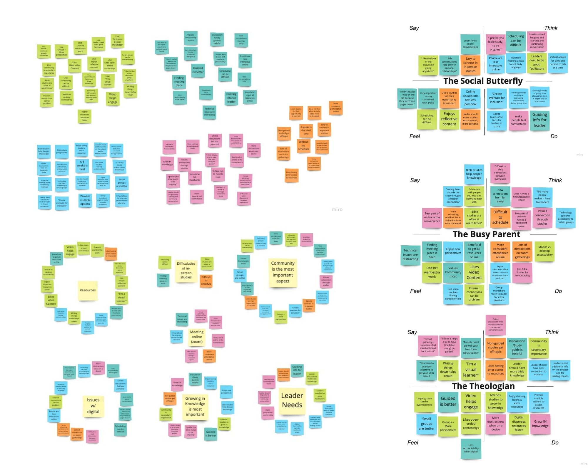
Affinity Diagrams
To bring this data together in a digestible way, I grouped the insights and comments into an affinity diagram. The affinity groups revealed several major ideas 4 of the top were the value of community, the needs/expectations of leaders, issues with digital environments, and issues/benefits of additional study resources. It revealed that most would rather not meet in virtual spaces unless needed, had high expectations of their leaders, and wanted more options for accessing the resources needed to participate in the study.
Empathy Maps
The affinity diagrams were then grouped into 3 empathy groups, the theologian, the social butterfly, and the busy mom.
Creating Personas
The Theologian
They take study seriously. Their goal is to grow deeper in knowledge in order to affirm their beliefs with data. Iron sharpens iron is the verse they live by, and they thrive on deep debate and discussion about scripture. Study groups are a time to connect and meet others in the church, but mostly it is about deepening their knowledge.
The Social Butterfly
The social butterfly’s main object is fostering community and relationships. They are great hosts whose main goal is making people feel safe and comfortable to share what they are dealing with. Bible study is a way to bring the people they love together.
The Busy Mom
From an older generation, the busy mom was raised with the mindset of discipline. They study the bible because that is what they are supposed to do, but due to their busy life as a parent, it doesn’t always happen. Studies are a great opportunity to get out of the house, but sometimes it is too tough to make it happen.
How Might We's
The final step in the research process was synthesizing this data into problem statements or How Might We (HMW) statements to clearly articulate the most pressing and core problems users want to be solved.
How might we keep people connected digitally?
How might we make it easier to get involved with bible studies?
How might we help leaders lead better?
How might we help people create a habit of bible study?
How might we offer resources that allow people to go as in-depth as they want?
03 Ideate
Brainstorming with sketches
After researching interviewing and synthesizing, it was finally time to start ideating! A quick brainstorming session got the creative problem-solving juices flowing. After some preliminary screen sketches, word maps, and other exploratory pencil strokes, I was beginning to get an idea of how this product was going to solve the Users’ problems.
User stories
Building on the data from my research, I created user stories to understand and identify the functional needs of the product before I started designing. I took these user stories and then categorized them by priority, with the highest priority solving the essential components the product will need for early users.
The user stories not only help understand the most essential features of the product but how the different features and components need to work together to create a seamless experience for the user
As a user, I want to...
sign up/log in so I can access the study/materials
see the lesson and background so I feel prepared to teach a lesson
share resources/components with the study group
have the option to access resources online
watch to share videos with the team beforehand so I don’t have to find a way to stream it during group time.
compile members' contact info so I can easily share materials
take notes while I am preparing
I want to send materials/study reminders to all users at once
Defining the Information Architecture
I created a sitemap to ensure all information and screens were organized in an intuitive manner, The sitemap helped visualize what screens were needed and where they would live in relation to each other and in the menu.
Mapping flows
Next, I created user flows to understand the pages and steps needed for users to complete the most essential tasks with the product. The visualization help understand the decisions and information needed to complete these tasks
For my MVP I chose 3 red routes that are essential to be included in the final product. The red routes are the login/register flow, the lesson preparation, and creating a new study group.
Sketching Screens
Next, I started to sketch out some ideas to explore some visual possibilities and add some form to the function. Sketching with pen and paper helped bring my ideas to reality and gave me a tangible way to quickly explore variations before making it digital and picture-perfect.
I leaned into a very modular approach. Since this product would have lots of long-form copy, I needed ways to condense it into less intimidating sections, making it easy for users to read without getting overwhelmed as well as find their way through a sea of text.
After sketching a few dozen screens I was confident in where I wanted the design to go.
04 Design
Wireframing
After iterating on these sketches, I began refining the ideas into low fidelity wireframes in Figma. Doing the wireframes helped to refine the scale and spacing in reference to the screen size, which helped prioritize what information goes where.
Defining the style
I wanted the product to take on the feel of the clients corporate brand, but I stripped it back some. I kept the style very simple and minimal, since the books and bible studies that will be featured each have their own unique brand style. The minimal/modern style also communicates trust and amplifies the value of the content presented to users.
I created a simple style guide to keep all the elements neat and consistent.
HiFi Wireframes
I spent a lot of time on the high-fidelity wireframes creating changes and refinements. Applying the design styles revealed various needs for spacing, restructuring, etc.
As I started to include the full copy from the print version of the leader guide, the amount of text got quickly overwhelming. The copy from the original leader’s guide is written in more of a story format, so I stripped that and condensed it into more of an instructional format. This reduced the amount by a lot, but there were still some large blocks of text I needed to deal with. I ended up breaking the text up into different sections to make it more digestible and easy to read.
I also made a few changes to different areas in order to allow for consistency in styles, buttons, and other UI elements
Testing the solution
Prototype
I used Invsion to bring my screens to life and allow for testing. I tried to create multiple avenues to the different sections and features I wanted to highlight so that I could evaluate how users chose to complete the tasks
Usability Testing
Time to put it to the test! I recruited 5 users to test the product in remote moderated sessions. 3 of the testers were from the original research interview group and the other 2 came from social media outreach. My main requirement for this group of testers was that they had experience leading Bible studies or small groups.
I created a usability test plan to guide the interviews:
Objective
How do users perceive the overall site design
How do users understand the organization of content?
Are there any usability issues in the Lesson Prep, and Group setup red routes
General perceptions of the applicability of leader features.
Test Tasks/Questions
Register
Complete lesson prep
Add a new group
Update susie in Group A’s contact info
Can users understand the group setup process?
Can users understand how the group feature can be used?
Does the main login screen make sense?
What are users' expectations before logging in?
How do users perceive the overall design and layout?
Test outcomes
Overall, users found the website relatively straightforward and easy to use/understand. The features were well received, and all test participants agreed they would be happy to use this product if they were leading a study.
Highest Priority Issues
Confusion around Share Feature: Users were unsure how to use the share feature and what was actually being shared with the group.
Lesson Preparation Flow: Users were unsure how the leader lesson translated to the group lesson. It was unclear what was for the leader specifically and what was supposed to be shared in Group time
Redesigns
After synthesizing the results, I input the changes and made a few redesigns to get my final product.
05 Outcome
Moving the Product Forward
If this product gets the green light there are a few improvements I’d make and features I would like to add.
First, I would like to dig into the lesson setup from a different perspective. For this initial round, I took content we already had and built the lesson set up around that. Instead, I would like to build out an optimal lesson flow, and then have our authors/editorial team create content specifically suited for this product.
There are also some big unknowns to work out when it comes to the entire customer journey. This product would either need to connect to our current online shop or have its own eCommerce marketplace, each of these have their own challenges and implications to the David C Cook ecosystem.
I would also like to give more attention to the Group communication feature. It was something that most testers really appreciated, and I’d like to build in the option to customize leader notifications so they can send messages to their team all at once.
Reflections
This project highlighted some areas I need to improve in.
Organization. This single UX project resulted in tons of files, documents, and images. An unorganized project can end up wasting a lot of my time. Moving forward, organization will be one of my first tasks as I work through projects.
UI. This is a part of the project I really enjoyed and something I want to dig into even more to develop my own unique style while also getting familiar with a broad range of styles.