While reviewing data for issues in the experience, we noticed students were taking a long time to start their coursework. We had just discovered that students who take more than 30 days to start are significantly less likely to complete any courses, so we knew we needed to get students engaged much sooner in their journey.
Working with a cross-functional team, I gathered research, insights, and data to identify gaps in the onboarding experience and design a guide to welcome students onto the platform, deliver important program context, and help them start their first course.
With this solution, we saw a 50% decrease in time to start and early indicators of long-term success metrics.
Type
Time
2022
StraighterLine
Responsive Web App
Client
01 Discover
Why are students taking so long to start?
I was not able to do user research in this phase; however, we already had some research on this population to pull from as well as a whole team who spoke to users regularly. I gathered research and data insights, conducted internal interviews, and reviewed the understand the user needs better and identify any gaps in the user journey.
After gathering the research, I pulled together the notes to identify patterns and relationships.
Affinity mapping insights from the data and research I gathered
02 Define
Is there such a thing as too much freedom?
One of the themes I noticed is that students really want more support and direction. The platform was originally setup to give students full access to all courses in their degree plan. They could complete the courses in whatever order they wanted and even do multiple at a time. However, this seemed to be something the students either did not want to do or didn't know how to.
The feature that was originally meant accommodate students was actually making it more difficult for them.
I also discovered that there were information gaps in the user journey causing students to miss important details around expectations and policies.
The navigation issue is something we were aware of, but we weren't able to tackle that issue at this time. So, I needed to help students understand the current navigation better.
We have the tools. But are they utilized?
For a couple of the issues, we already had resources to support the solution. We just needed to call attention to it so the students didn't miss it.
Platform tour: It was already created, but it popped up immediately after registration. If a student skipped it, they couldn't get back to it.
Orientation: This explains all the policies and context details the students need to know, but many students skip it or just click through it quickly. I need to communicate its value and importance better.
Sequencing the information
Based on the insights from the discovery, I mapped out an updated user flow for the onboarding phase. I focused on building up information from a foundational level—each step equipping the student to access, understand, or retain information shared in the next step.
03 Ideate
Building ideas. Gathering feedback
With an understanding of what needed to be accomplished during onboarding, I started pulling the ideas together so I could get feedback from stakeholders and get into some technical feasibility discussions. I pulled together a quick wireframe share the idea of an onboarding guide, the steps that should be included, and how we could help students choose their first course.
I shared this with stakeholders, then met to go over the feedback.
Great feedback but a major roadblock
The idea was very well received and got many of our stakeholders excited.
However, there was a big issue that we had to deal with. Giving students the 3 course choices would be a huge development undertaking requiring a logic engine and additional data points for every course we offer.
The course decision cards are gone. How can we make the first course decision easier?
A two phase approach
Phase 1 would be a simpler solution that does not require any new data architecture, definitions, etc. This would give engineering time to work on the core structure and allow us to test manually providing course recommendations while enrollments were low.
While that was being developed, our academics team developed a tool to rank all of our courses on a common scale based on course data we had on effort, time to complete, course NPS rating allowing me to design a solution that recommends an easy course for them to get familiar with the learning experience, develop good habits and grow in confidence.
Iterate. Refine.
Now that I had a more solid understanding of the technical constraints and possibilities, I could design something more realistic. I spent time sketching to try out different ideas for reducing the size, organizing the content, and identifying where it could live.
04 Design
Finding a home for the guide
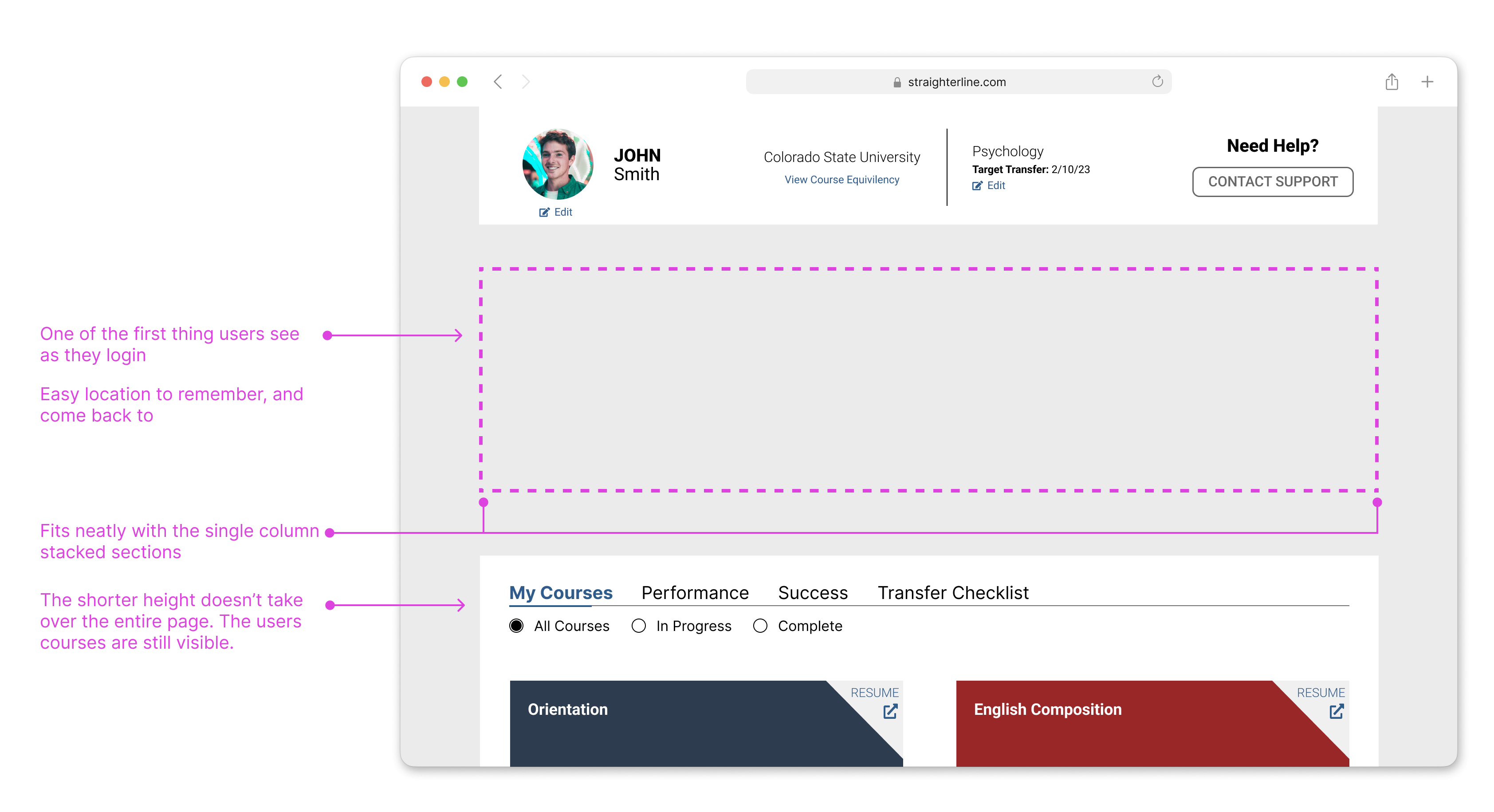
I had a difficult time finding a place where it felt like it fit. I wanted a sidebar, but that wouldn't really work with our current layout. I considered it working as a modal, but that came with extra accessibility and discoverability issues. I landed on the space between the profile details and the course area. The sections were already clearly defined because of their white backgrounds, so I could make it feel like it was another section on the page, and use their proportions to define the size.
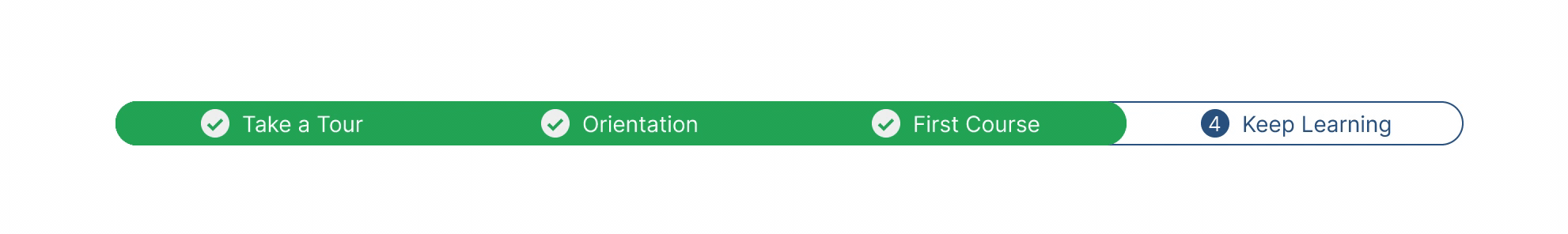
The progress bar-A map and an indicator of accomplishments
The progress bar served as more than just a list of steps, it was also an opportunity to engage students early by recognizing the completion of these smaller steps and helping them see that they are making progress.
2 Phases for the course choice step
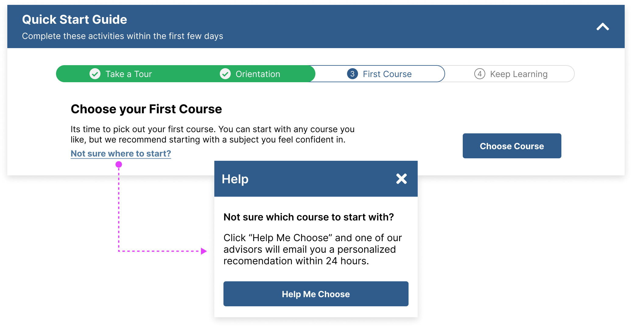
Phase 1:
For the phase 1 design, we didn't have a decision engine built in yet, but I wanted to make sure users were taking the time to make a course choice at that time.
For this step I wanted to encourage the user to make that choice now, give some context, and make it super easy for them to ask for help if they didn't want to make that decision themselves.
Phase 2
For phase 2, we now had a way to recommend a "first best course". Rather than making them choose, we decided we would assign each student a first course. This accomplished a few things:
It made it simpler from a data perspective. By focusing on one course we were able to create a single course ranking list which allowed us to recommend the first best course for each degree plan. (Degree plans are a list of courses that the student gets based on what degree they are seeking and which school they are planning to transfer to.)
The ranking list focused on ranking courses by effort, length, and satisfaction. The course needed to be relatively easy (based on average grade, satisfaction score, and the number of assignments/tests) and short (based on completion time). By recommending an easy course, students could ease into the learning journey, develop some habits or routines, and gain confidence in their own ability.
I also tweaked the copy some to accommodate the data model we had to work with. In the current system, a "Course Start" was defined as "the completion of the course's first required assignment". This definition controlled the completion status of this step. While I didn't like jumping straight to the first assignment completion (there are important steps that happen in between), it was helpful to focus the student on a very tangible milestone in their course journey.
Defining interaction
Annotating interaction, navigation, and completion definitions.
Prototyping for approval and understanding
The final prototype served several purposes for my design process.
It gave an easy way to show how the interactions happen.
This was much more tangible view so it was easier for stakeholders to understand the intent and function.
It gave me the chance to educate our student facing teams on what this was and how they could support and questions or issues that come up about it.
05 Outcome
Telling the story with data
Measuring the success of this solution was essential to being able to prove that we understood the users needs. I worked closely with our analyst to define how we would measure and calculate results. All data was compiled in a dashboard, and our analyst reported back data every 2 weeks until we hit our minimum threshold.
Main data point: Time to Start
Benchmark: average time to start over the last 2 years of data
Timeframe: We would continue gathering data until a minimum of 100 students had completed the guide. This would give us enough data to confidently share if it was a success or not.
Extra data: while our main metric was time to start, we we wanted to kept our eye on the average time to first course completion.
Identifying issues early
Since I did not get to test this solution with students, I wanted to make sure that the guide was not introducing new issues or roadblocks. I worked with our student facing teams to develop an incident reporting plan, ensuring the issues, feedback, and details were compiled and that I was notified. Fortunately. we did not encounter any issues.
Final Outcomes
The final solution performed better than we anticipated. We were able to launch the phase 2 designs right before a large influx of new students which gave us plenty of data to evaluate the effectiveness.
Reduced time to start by nearly 50% (statistically significant) Early data showed students were completing their course faster
.png)
.png)
.png)
.png)